Each season the Pantone color institute identifies its favorites from the palette. In 2017, there will be not one or two colors in the trend, but as many as ten!
This time, Pantone pleases us with such unusual colors as "kale cabbage" and "blue lapis". Presenting these shades without illustrations will only be an employee of the institute of color.
So, see the top ten fashionable colors of 2017 according to Pantone version:
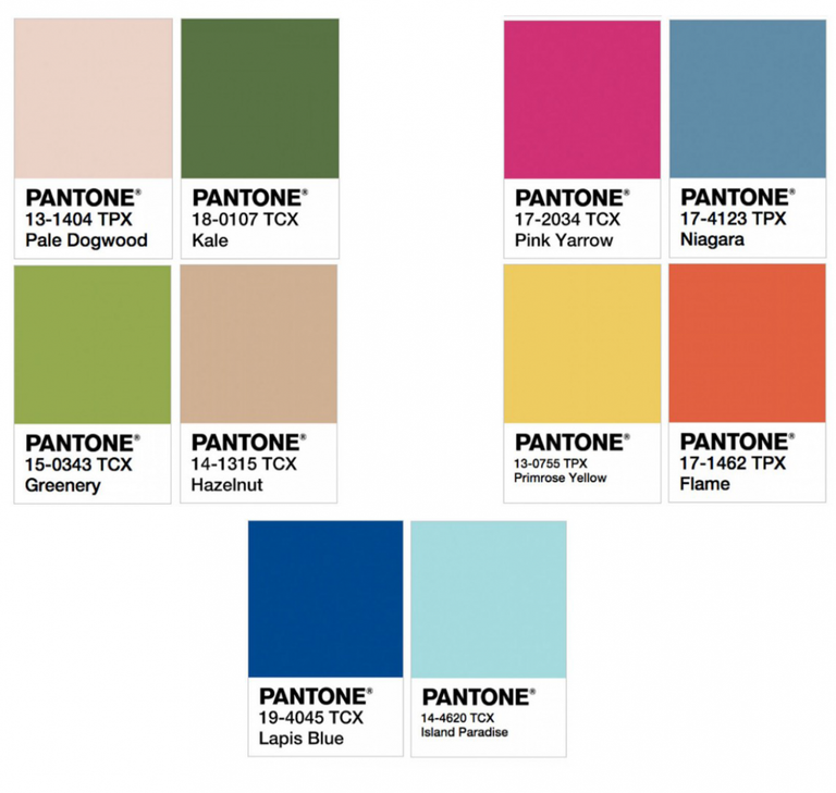
The colors of 2017 by Pantone:
1. 13-1404: Pale Dogwood
2. 18-0107: Kale
3. 15-0343: Greenery
4. 14-1315: Hazelnut
5. 17-2034: Pink Yarrow
6. 17-4123: Niagara
7. 13-0755: Primrose Yellow
8. 17-1462: Flame
9. 19-4045: Lapis Blue
10. 14-4620: Island Paradise
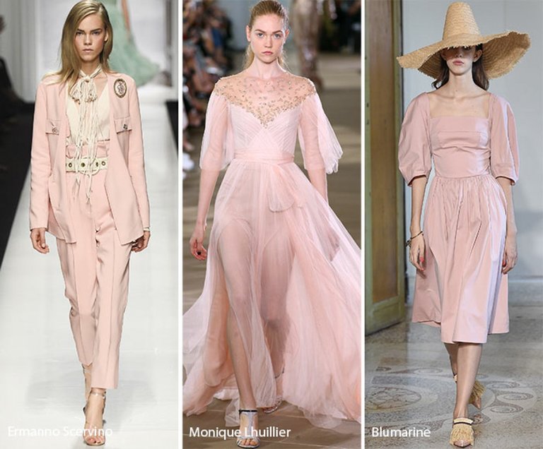
Color 2017 by Pantone: Pale Dogwood
Pale Dogwood
To put it in simple terms, it's a neutral muffled pink. It is as if called to emphasize the innocence and purity of his mistress. The color "pale cornel" can be seen in the collections of Chanel, Hermes, Christopher Kane, Custo Barcelona and Blumarine.
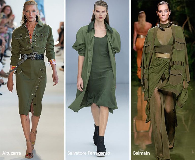
Color 2017 by Pantone: Kale
Kale
The subject of the military does not want to leave the podiums. Although feces are associated more with a healthy diet, this color fits perfectly into the army-themed collection. Who just did not use this shade of green! Altuzarra, Bottega Veneta, Mulberry, Salvatore Ferragamo, Valmain, Sonia Rykiel, Fenty x Puma, Louis Vuitton - the list goes on and on!
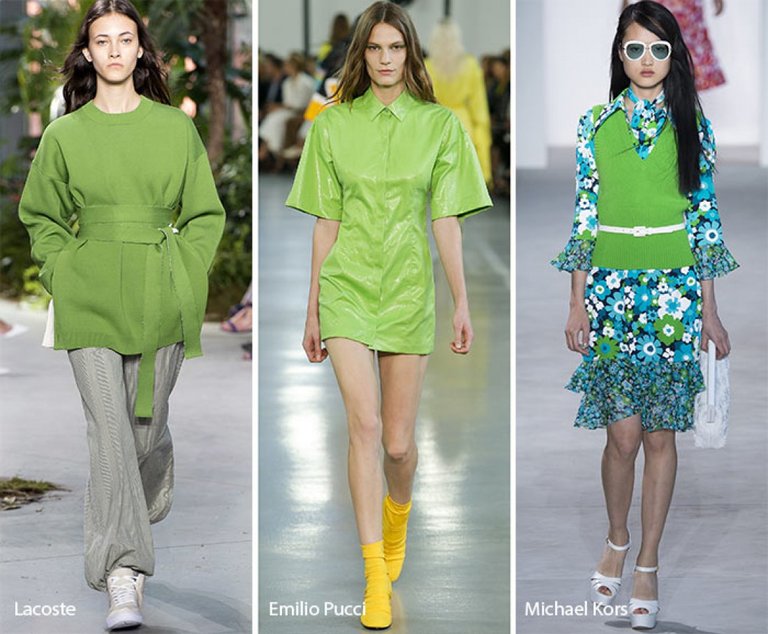
Color 2017 by Pantone: Greenery
Greenery
Next on the list of fashionable colors in 2017 is "green". This refreshing mixture of green and yellow is ideal for the upcoming spring-summer season. This is particularly insisted by designers brands Celine, Emilio Pucci, Haider Ackermann and Dsquared2.
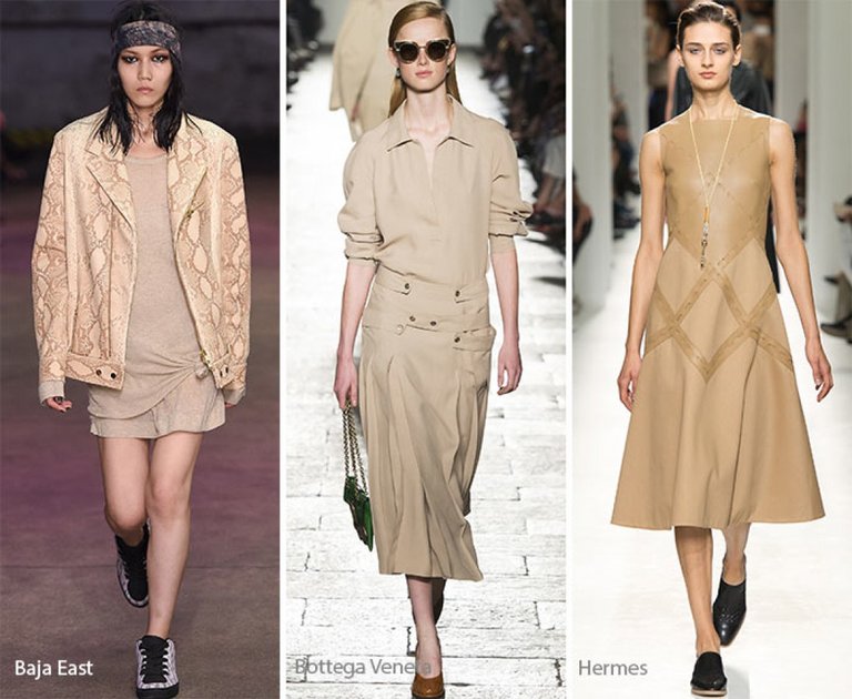
Color 2017 by Pantone: Hazelnut
Hazelnut
Which color is the most popular and universal? Neutral "hazelnut"! It refers to the warm range, which is literally idolized Creatures of the Wind, Cushnie et Ochs and Zadig & Voltaire.
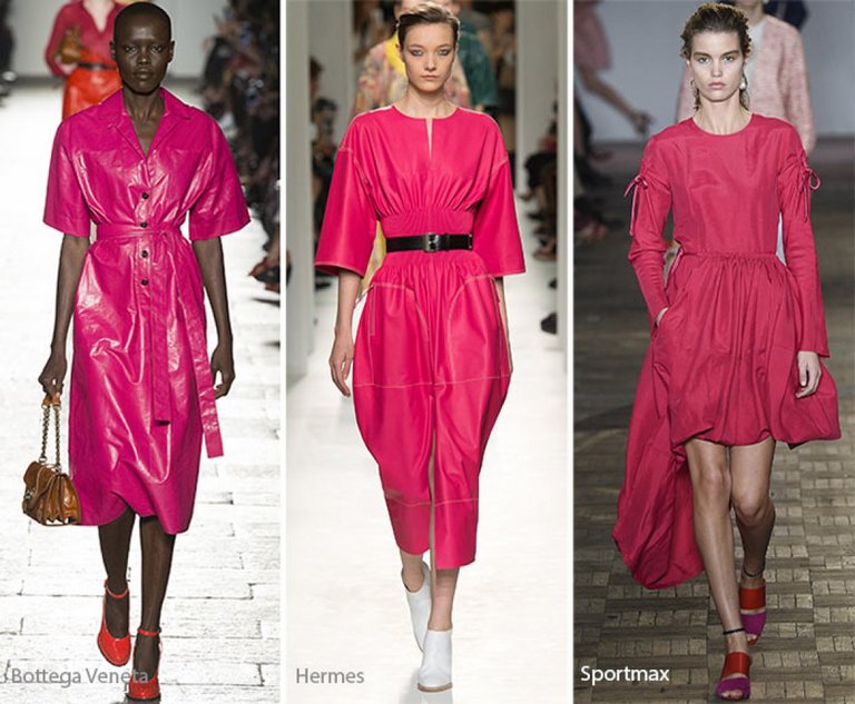
Color 2017 by Pantone: Pink Yarrow
Pink Yarrow
Close proximity to fuchsia makes this color the brightest and the most noteworthy of all ten from Pantone. By the way, designers Balenciaga, Zac Posen, Hermès and Topshop Unique supported the "pink revolution".
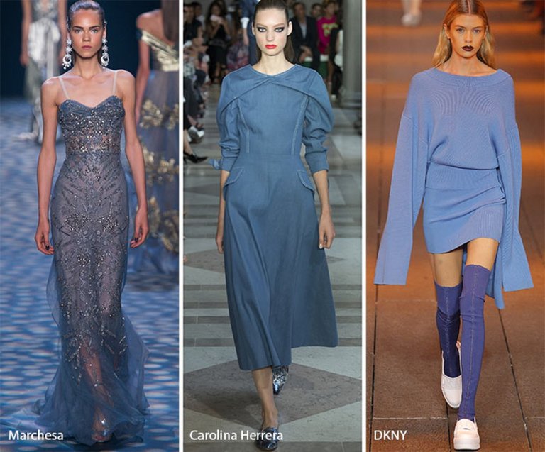
Color 2017 by Pantone: Niagara
Niagara
The soft and relaxing color of "Niagara" reminds us of the fashion on the denim, which never goes on the decline. Most actively this color of 2017 appeared in the collections of Altuzarra, Carolina Herrera, Emporio Armani, Alberta Ferretti, Alexander McQueen and Marchesa.
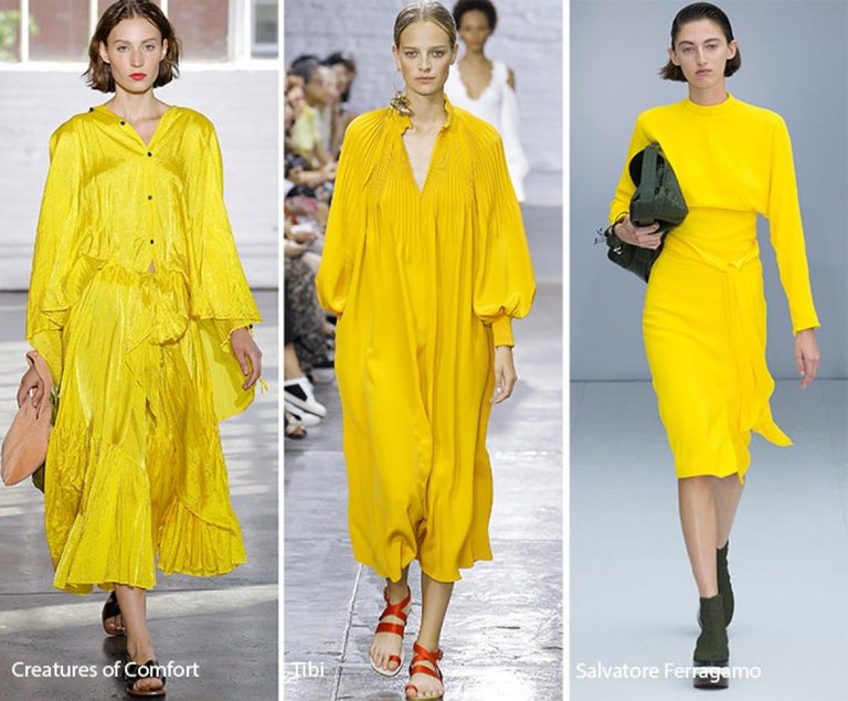
The color of 2017 by Primrose Yellow
Primrose Yellow
If the main yellow of last season was "spicy mustard", then in this - an invigorating and sunny "yellow primrose". This trend has already been supported by Dries Van Noten, Gucci and Chloé.
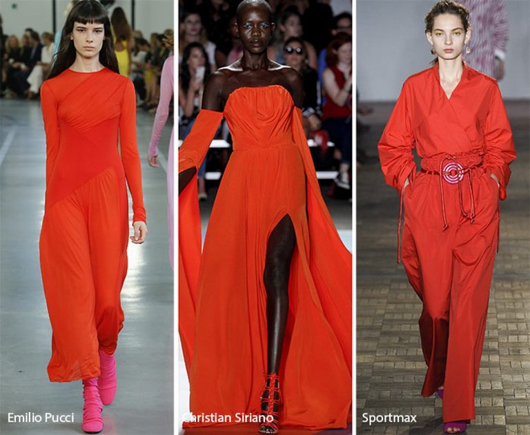
Color 2017 by Pantone: Flame
Flame
Lovers of bright red and orange will definitely like this color of 2017. Passion, ardor, strength - that's what we associate with "flame." Surely, the designers of Christian Siriano, Oscar de la Renta, Tory Burch, Tadashi Shoji, Givenchy and Mulberry had the same thoughts.
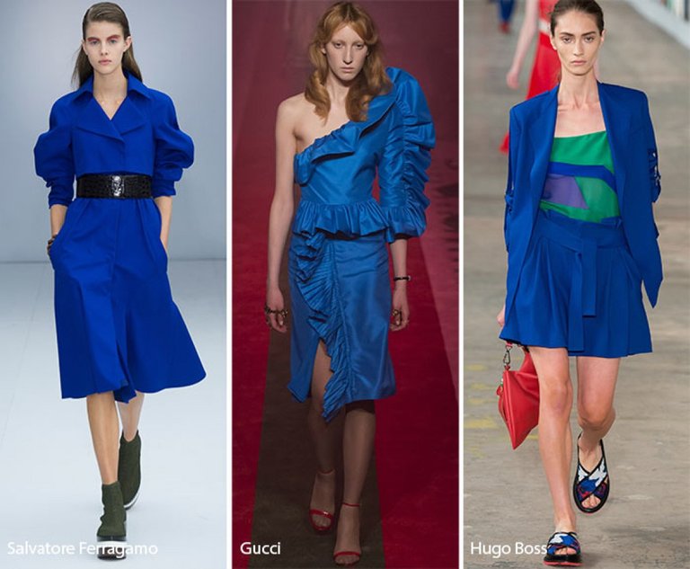
Color 2017 by Pantone: Lapis Blue
Lapis Blue
If you are not a fan of classic blue, we have a solution - "blue lapis". Electrified, enticing, glowing from the inside, this color will be enjoyed by all without exception. Designers Salvatore Ferragamo, Max Mara, Mugler and Mary Katrantzou approved.
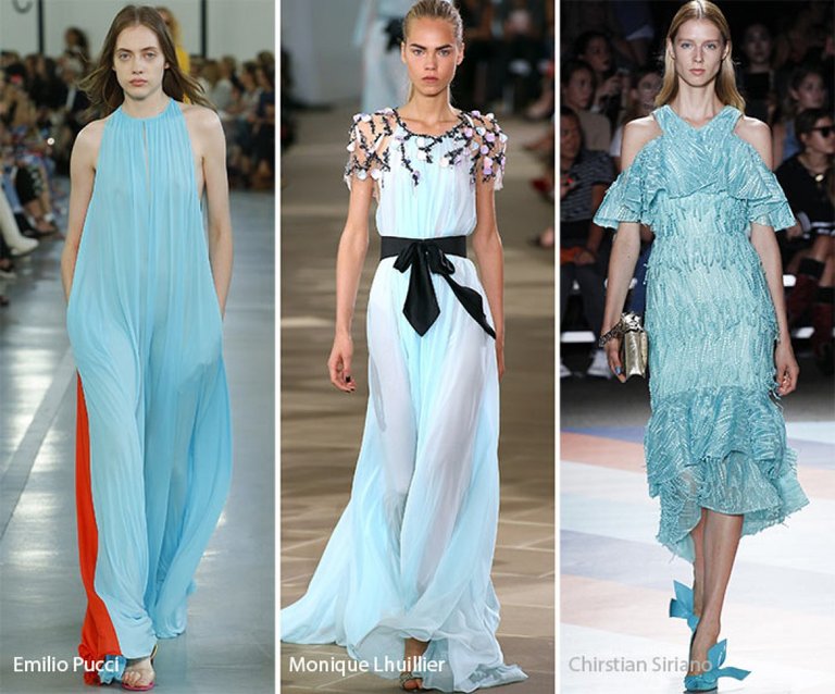
Color 2017 by Pantone: Island Paradise
Island Paradise
A little more blue will not hurt, decided with Monique Lhuillier, Emilio Pucci, Escada, Loewe, Vetements and _Barbara Bui._The shade of the sea wave will take you to the tropics in a matter of minutes.
Thank you for reading my post. Don't forget to subscribe to me
♥
xxx
Fashion with anatworld ;)
:)
Welcome back.
Congratulations @anatworld! You received a personal award!
You can view your badges on your Steem Board and compare to others on the Steem Ranking
Vote for @Steemitboard as a witness to get one more award and increased upvotes!