Explanation/process of the logo will be included starting from DLG #39 (Daily logo design #39). :)
Company name: SITIO energy
Industry: Energy
Link to the contest: Click me
Brief Description:
- Energy generation is symbolized by the line, which is the shape of electric when tilted 45 degree.
- The two blocks represents commercial buildings.
- The line is located in between to symbolize supplying energy to buildings.
- Red color theme is used to represent strength.

Process
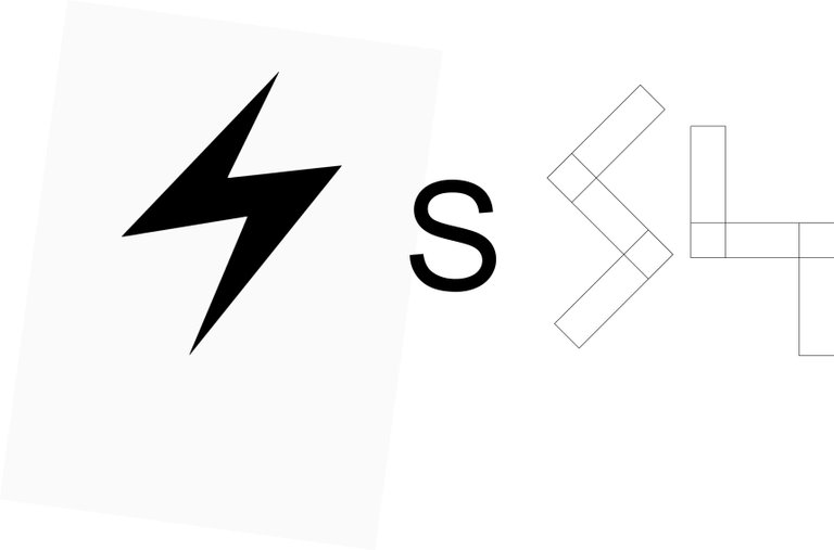
The middle piece is inspired by symbol of electricity (energy) and "S" as in SITIO.
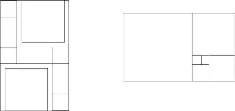
The two blocks (to represent commercial building as requested) are added into the design.
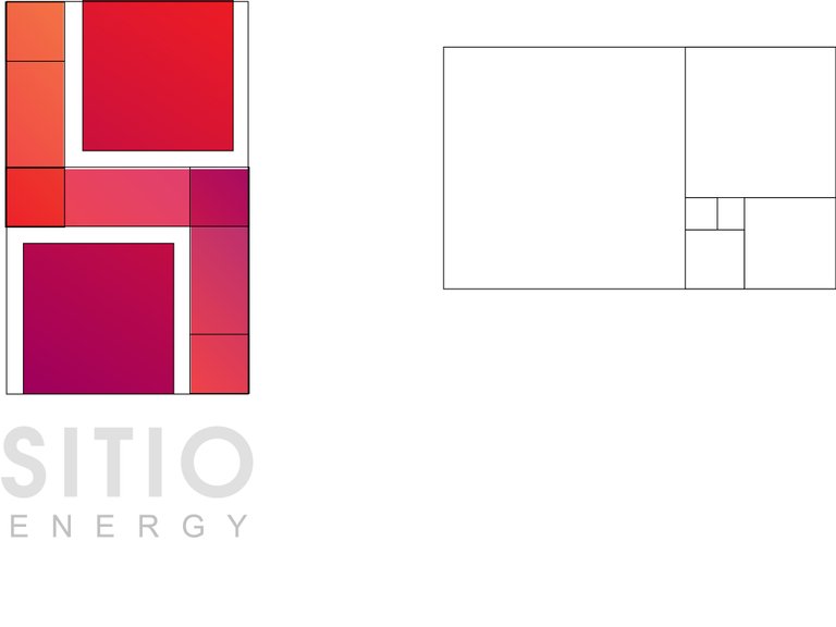
Red theme was used to represent strength.
Results
