The resultLast month @fabiyamada completed a task request to redesign our webpage. was received very positively in our @steemmakers community and when time allowed for it I started working on a template that can be later implemented in our web app. This was the first time I implemented a responsive web page that was this complex in design and it required a lot of work.
The design
As a reference I'll first remind you of how the design by @fabiyamada looks like:
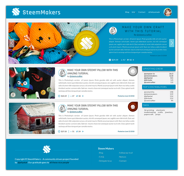
The design provide more than what was asked in the task request on some aspects. We were mainly looking for an update of the article previews to incorporate our scoring system. Instead we got a whole makeover including featured articles. That's something we are not ready for yet and I did not incorporate it in the template. On the other hand the design had no previews for responsive design.
The process
We created a separated channel on our discord to discuss how things should scale and got quite a few conversations and mockups about what we could do with it. Especially @podanrj was very helpful. I had to make many small steps and every now and then I uploaded what I had to a test location so others could check it on their devices. Responsive design is about making it look good on all devices. So the more the more people having a look at it the better the feedback can be.
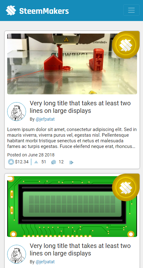
We discussed most about how we should place the badge in case of mobile view and how to handle the image preview. steemit.com has its own way of handling this by using a fixed ratio and cutting parts of the image in thumbnail preview. Some members had concerns about this approach because it cuts part of the image and we considered it better to show the complete image with whitespace around it. (as it is currently on steemmakers.com) In the end the consensus was to zoom the image to always have a consistent layout. It make the site looks better and it is a thumbnail. This same approach is used by many other big names such as twitter, facebook, ...
The result
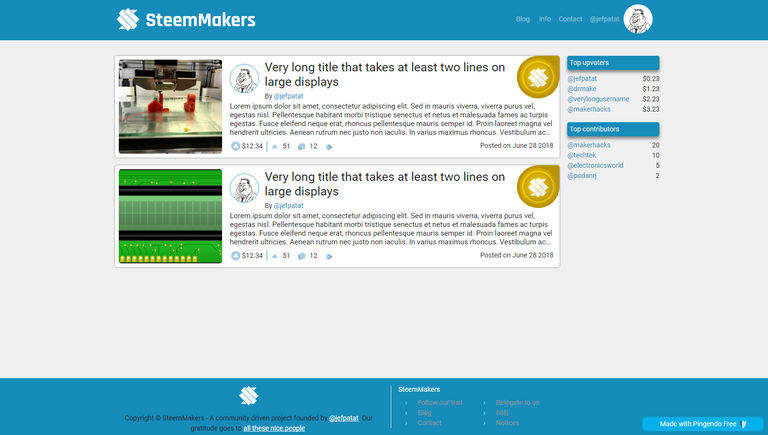
On a desktop:
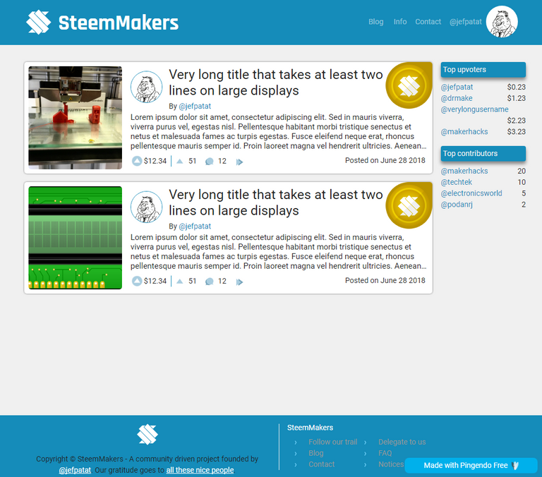
On a laptop:
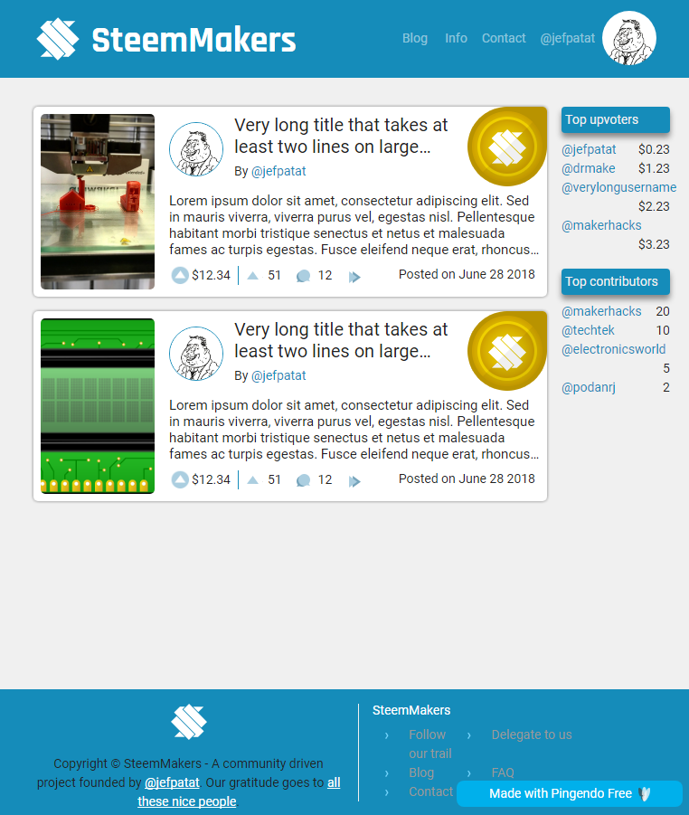
On a tablet:
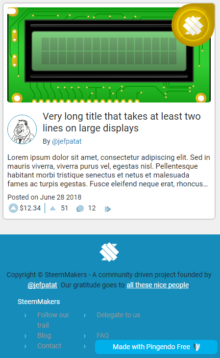
On a mobile phone:
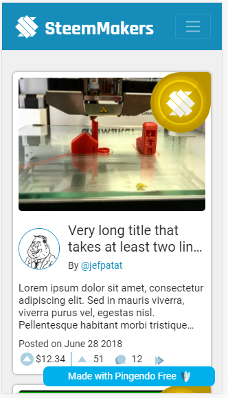
On an IPhone 5
I also made a 14MB animation showing all responsive transitions and the scaling of the images. I uploaded it to a separate location so to not to bother my followers on a data limit. You can find it here.
Live version
A live version can be found at https://www.steemmakers.com/test/Home.html . If you happen to see any issues let me know please.
Future work
Obviously this is only the first step. The design is sufficiently complex for a novice like myself to make a separate page first before integrating it in the web app. Our web app has a good MVVM separation so it should go smoothly to actually implement it. I'm looking forward to see all the hard work by everybody go live, but first, some more work.
Proof of work done
Repository: https://github.com/JefPatat/SteemMakers/tree/master/website
My github account: https://github.com/JefPatat
Relevant commits: several commits from July 17th to July 27th: https://github.com/JefPatat/SteemMakers/commits/master

Thank you for your contribution.
Your contribution has been evaluated according to Utopian policies and guidelines, as well as a predefined set of questions pertaining to the category.
To view those questions and the relevant answers related to your post, click here.
Chat with us on Discord.
[utopian-moderator]Need help? Write a ticket on https://support.utopian.io/.
Thanks for the feedback @justyy. Both 1 and 2 are related to the fact that this is only a template and not a final implementation. This is more a proof of concept to be able to style the final app. Styles will get split up over several components anyway so you shouldn't think of this as a final result. The hamburger menu simply isn't implemented in the template.
Good job team 🥂. The medal is really an unique feature.
Thanks for your help brade ;-)
Yeah. We are brade and siste 😅
Thanks for contributing on Utopian.
We’re already looking forward to your next contribution!Hey @jefpatat
Want to chat? Join us on Discord https://discord.gg/h52nFrV.
Vote for Utopian Witness!