Hot on the heels of publishing my previous article about a YouTube downloader, I'm back(as I said I would) with a sequel to that post. I will not waste time on niceties about the previous article. I decided to begin a series about some Youtube downloaders I've used. The main purpose of the series is to review these apps. And if you use YouTube a lot, you could try them out. In the previous article, I reviewed YouP3, and also compared it with YouTube. In this article, I'll be reviewing NewPipe. But instead of Youtube, I'll be doing comparisons here and there with YouP3.
NewPipe; A libre lightweight streaming frontend for Android.
The app I'll be talking about in this article is NewPipe. As you may already have known, it is a YouTube downloader(as I like to call it). In my previous article where I reviewed YouP3, I talked about a little about the app's name. And I'll like to do the same thing here. I had issues with YouP3(as the name of an app). And, I think I have little issues with NewPipe too. NewPipe sounds like a sleek name though, no doubts. But it doesn't quite give off a hint about what kind of app it is. For YouP3, I was able to decode how the project owner(s) came about the name. But in the case of NewPipe, I have no idea. There's no correlation of the app's name with its function. Well, as I said in the previous article, the name of an app matter, but not so much. So I'll move ahead.
Before I proceed with my review of NewPipe, here's a very short description of the app, gotten from here
NewPipe has been created with the purpose of getting the original YouTube experience on your smartphone without annoying ads and questionable permissions.
The application is open source and you can check on it at GitHub.
That's the app's simple description. But don't be deceived by the simplicity of the app's description. The app is a beast. And you'll find out why I say so(it's a beast) in this review.
Review of NewPipe.
To aid in my review, I'll be working on the premise of the app's features already listed here. The features of NewPipe are;
Features
- Search videos
- Display general info about videos
- Watch YouTube videos
- Listen to YouTube videos
- Popup mode (floating player)
- Select streaming player to watch a video with
- Download videos
- Download audio only
- Open a video in Kodi
- Show next/related videos
- Search YouTube in a specific language
- Watch/Block age-restricted material
- Display general info about channels
- Search channels
- Watch videos from a channel
- Orbot/Tor support (not yet directly)
- 1080p/2K/4K support
- View history
- Subscribe to channels
- Search history
- Search/watch playlists
- Watch as enqueued playlists
- Enqueue videos
- Local playlists
- Subtitles
- Livestream support
- Show comments
Whoa!!! That's a very long list of features. I could talk about all of them individually, but I won't. If you look at the list closely, you'll find out that some of the features are kind of linked. What I'll do is; compile these linked features into a group, then go ahead to review them. Now, some features might not make it into any group, but I'll review them anyway. To be precise, here's the list of groups and features I'll be talking about;
- User Interface
- General
- Playlist
- Media player & playing modes
- Subtitles
- Download manager
That's all I'll be talking about in this article. Now, aside from reviewing these features, I'll be doing comparisons with YouP3 where necessary.
NewPipe's User Interface (UI).
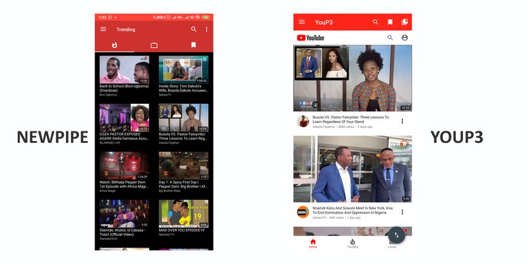
NewPipe has an amazing interface. It is smooth, clean, and sleek. It doesn't have that Youtube feel that YouP3 also has. The style used on the interface is a little bit different. Being different doesn't make it less beautiful though. But I would have appreciated the app's UI more if it looked like Youtube, or even YouP3.
The app has some other UI options though. But I appreciated the theme options more. The availability of theme options served as a compensation for me, since I already felt bad the app lacked that YouTube-y feel. As you might have guessed, the theme options are;
- Light
- Dark
- Black.
I'm excited to have black and dark themes. They are literally the same thing(kind of). The dark theme gives you a normal dark-mode. The whole UI of the app turns black. It's pretty cool. The black theme does the same thing too, but it is shinier. It'll look great on devices with an AMOLED screen. My device has a normal LCD screen, but I'm using the black theme. It looks really great.
Overall, I'll say that NewPipe looks really great. That's irrespective of the YouTube-y feel that YouP3 has. YouP3 didn't have theme options, and that was the only let down for me. I appreciated the fact that it had that YouTube feel, and also a fullscreen mode. Honestly, it is hard to say which app has the best UI. If YouP3 had theme options, it easily would have been my best app(in terms of UI). NewPipe has theme options, but it lacks that Youtube feel(for me). What this means is that I had shortcomings in both apps(NewPipe and YouP3), so they draw level for me.
General.
Under general, I'll be talking about the basic features that the app has. By basic, I mean the features/functions or services that the app was designed to render. They are;
- Search videos
- Watch YouTube videos
- Listen to YouTube videos
- Download videos
- Download audio only
- Search channels
- Watch videos from a channel
- Subscribe to channels
- View history
- Search history
- Show comments
Virtually everything on the "features" list is in this group. And you'll not dispute the fact that the features here are quite basic, and are expected in this kind of app.
As an end-user, I should be able to; search for video, listen/watch them, and ultimately download them. The features I'll be talking about are the ones YouP3 doesn't have. Or the ones YouP3 does differently.
The first thing I'll be talking about is downloading files(Video and Audio) on NewPipe. Downloading content on NewPipe doesn't require any special kind of mode. On YouP3, the developer split downloading files into two modes. That is; basic mode & advanced mode. On basic mode, I could download only audio files. While on advanced mode, I could download audio and video files. I don't know why the developer designed the app that way. It wasn't a big deal though. I chose "advanced mode" and that was it. Well, on NewPipe, there's nothing like a "download mode". I only need to open a video and click on the download button. It was pretty simple to do on NewPipe, same as it was on YouP3.
The second feature I'll talk about is the "history" feature. I'm talking about it because it is a feature that YouP3 doesn't have. Or it does have it, but not the way it is on NewPipe. On NewPipe, as soon as you open and watch a video, it registers into the app's history. There is a dedicated history page. I like the idea of a history page. It is a complimentary feature to a bookmark. Now aside just being a compilation of contents I've previously viewed, the history page is a sort of playlist on its own. Take a look at the image below;
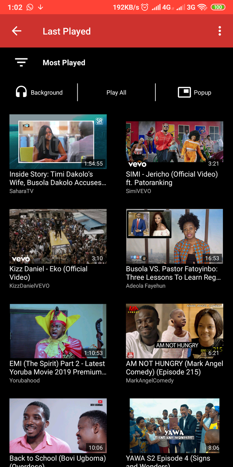
If you look at the history page, you'll find these options; background, play all, and popup. All these options will do one thing do though, and that is; play the songs on the page. Inadvertently, you can create a playlist off your history. But, I don't think there is a need for that though. The app has a playlist feature.
Aside from the history page, everything else can be done on YouP3. Like I said earlier on, those features are what I'll normally expect on this kind of app.
Playlists.
Here are the features I linked together to form the playlist group;
- Local playlists
- Search/watch playlists
- Enqueue videos
- Watch as enqueued playlists
The main feature in this group is the local playlist. NewPipe allows the creation of playlists. And I'm excited about the feature.
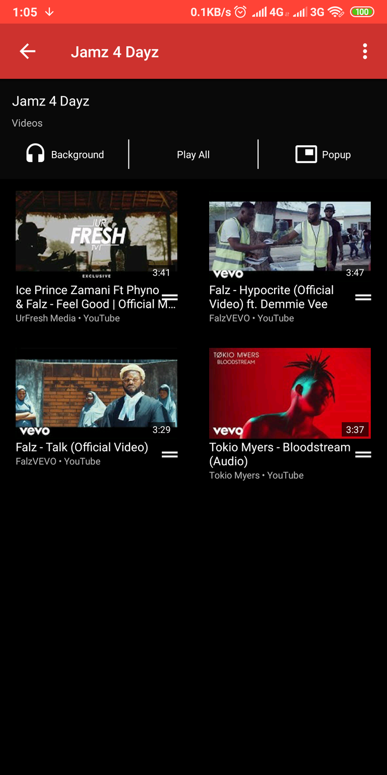
The local playlist serves two functions. It serves as a playlist, and also a bookmark function. NewPipe doesn't have an actual bookmark feature as YouP3. On NewPipe, when I add a video to a playlist, it becomes as though I have bookmarked the video. The reason I say so is because of how the dedicated playlist page is titled. The page is titled; "Bookmarked Playlists". This is why I assume it to be performing two functions. It's cool though, but I'd ideally have loved a dedicated bookmark page, and also a playlist page.
Aside from creating a local playlist, you can enqueue videos, which indirectly becomes a playlist. Now, this is not an actual playlist where you can see the list of items on it. You just add the videos, and that's all. When setting up an enqueued playlist, it is best to use the background player(I'll talk about the players soon). The background player was faster to use. The pop-up player took a little time to load.
Media player & playing modes.
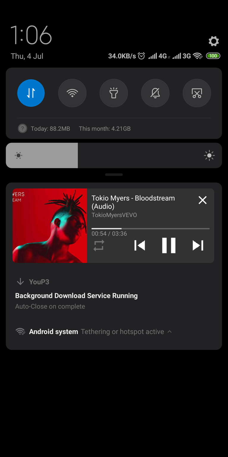
From all I've said so far, you know it is very possible to watch/listen to videos on NewPipe. But the developer made playing content on NewPipe a little bit extra, and I applaud him for that. There are practically three different ways to view content on NewPipe. You can decide to watch it right there on the app, you can use the background player, then there's the popup player. I talked about the popup player when I reviewed YouP3. The pop-up player is powered by picture-in-picture mode, that was introduced in Android 8.0. This allows a popup player to display above a page. Pretty sleek feature. I liked the fact that it existed on YouP3, and I'm grateful it is available on NewPipe. But, speaking in terms of players, I was very fond of the background player. It was especially useful when I opened desired to listen to a song but didn't actually want to watch the video. With the background player, I'm able to minimize a video and play it as though I was using a music player. With the background player, I have music control buttons on my notification panel. That means I can pause a song, or play the next or previous song(if I enqueued a playlist, or played from the actual playlist).
Subtitles.
On NewPipe, you are able to get subtitles on a video you are watching(using the main player). The subtitle is auto-generated, and perhaps that's its biggest flaw. The app uses voice recognition to provide the subtitles, and it is not always accurate. In fact, the accuracy level is below 60%. But I blame neither the app nor the developer. The subtitle feature(mechanism) on NewPipe is the same as the one on YouTube. It's cool, but I'll rarely use it. I'm glad it is available though. And yes, the feature is available on YouP3. I forgot to include it in my review.
Download manager

This feature is the main reason why this app is important. And why I'm writing this review in the first place. Yes, it is possible to download content on NewPipe. And this download progress can be monitored on the app's download manager.
Similar to that of YouP3, it is possible to pause and resume a download progress. And there's even an option to queue a download progress. It was really nice.
Although I'm done reviewing UI, I just have to say that I loved the organization of the download manager. The page looks smooth and clean. Far better than that of YouP3.
Still on the issue of downloading content, there's quite a difference between both apps(NewPipe and YouP3). NewPipe seems to offer more audio/video quality options to download. And I appreciate that.
Summary.
In this article, I've been able to review NewPipe with my own terms, and opinions. I've also compared it to a similar app(YouP3), which I reviewed some days back. From everything I've said in this review, you can see that NewPipe has more features than YouP3. Although most of them aren't tangible enough to make critical decisions to use(or not to use) the app. I particularly liked the playlist feature on NewPipe. The playlist feature coupled with the background player makes a great combo. But using the app as a music player isn't something I'll do a lot. I have internet subscription to care about.
NewPipe is an amazing app. For the times I used it(especially to aid this review), I had a good experience. I didn't encounter any bug, and that's a good thing. The only thing that was a little bit of let down, was that Youtube vibe that I didn't feel. This was felt in the app's UI. However, in my review, I said NewPipe's UI is great. Especially for the fact that it had dark themes. Then again, NewPipe doesn't have the sign-in feature which YouP3 has. That sign-in feature on YouP3 was quite important to me. I was able to access all the information associated with my account. The only thing different from the official YouTube app was the ability to upload content. To sum everything up, I'll say NewPipe is a better app than YouP3 in terms of features. But in terms of having an actual YouTube experience, YouP3 does it for me. Conclusively, I'll say both apps are great. They perform their basic service(download Youtube content) perfectly.
Thanks for reading!
Links
Project repository: https://github.com/TeamNewPipe/NewPipe-legacy
App download link: Latest release
Resources:
The content of this post was created based on my knowledge of the project, and mostly from my experience. The images used are screenshots of the platform on my device. Other images gotten elsewhere have their source links provided just below them.
Thank you for your contribution. Newpipe is a fantastic project. I have been using it for over two years, and it has been wonderful.
I appreciate all the information. However, there is a disparity between the quality of the content and that of the presentation. The post details the uses, features, and your experiences with it. However, the issue I often have with your posts is the use of superfluous words. If you want your readers to enjoy reading your post, try to write concisely.
Further, the presentation, I appreciate the short sentences, but some are fragments. I understand that you set the readability on Hemingway, but Hemingway is just a tool and could confuse writers sometimes.
Overall, this is a decent effort, and I appreciate it.
Your contribution has been evaluated according to Utopian policies and guidelines, as well as a predefined set of questions pertaining to the category.
To view those questions and the relevant answers related to your post, click here.
Need help? Chat with us on Discord.
[utopian-moderator]
Thanks for your review @tykee. Please I'd appreciate if you cited examples of the errors in my post. Thanks.
There are many issues in the post, but I will cite a few.
I ‘’decided to begin’’ is extraneous. You could say: ‘’I began a series about some Youtube downloaders I’ve used.’’
A little bit is redundant. A little or a bit, choose one.
Readability could be improved with: ‘’So I assume it to be performing two functions.’’
Another tautology. Reason and why.
Here, the second sentence is a fragment with excessive words. That could read as: I said NewPipe’s UI is great, especially because it had dark themes.
Thank you for your review, @tykee! Keep up the good work!
Hey, @harry-heightz!
Thanks for contributing on Utopian.
We’re already looking forward to your next contribution!
Get higher incentives and support Utopian.io!
Simply set @utopian.pay as a 5% (or higher) payout beneficiary on your contribution post (via SteemPlus or Steeditor).
Want to chat? Join us on Discord https://discord.gg/h52nFrV.
Vote for Utopian Witness!
Hi @harry-heightz!
Your post was upvoted by @steem-ua, new Steem dApp, using UserAuthority for algorithmic post curation!
Your post is eligible for our upvote, thanks to our collaboration with @utopian-io!
Feel free to join our @steem-ua Discord server