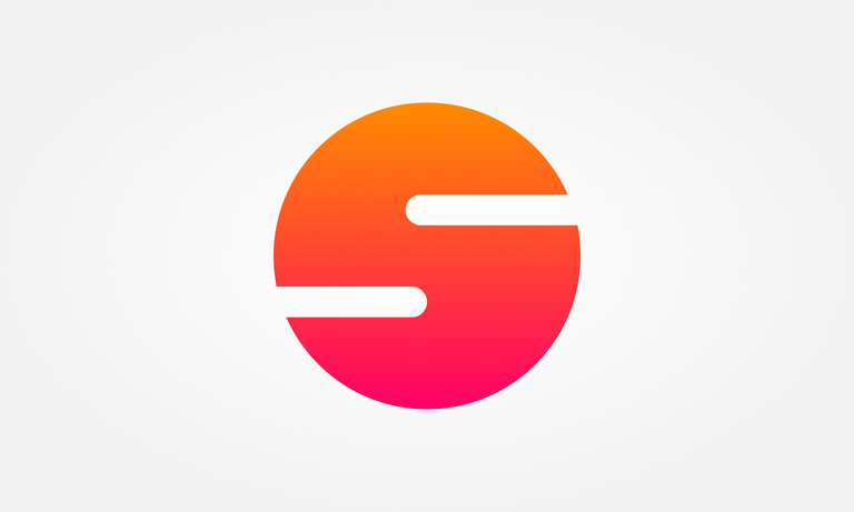
Recently, I have been slightly focussing on the branding of my Steemit blog.
WOOT! I decided to have consistent header images on all my posts. Initially, they just used to be photographs, but a couple of weeks ago I decided that it needed to consist of a text and my face somehow. I wanted to induce some more personality to my blog. I already had a footer and now I had consistent header images. Yet, there was something missing still - a logo.
I figured I needed a logo to round this branding up and create both a cover and a footer accordingly.
I wanted a complete and entire Steemit branding for myself. So that is what I did. Gosh, sometimes it really pays off to be a designer. Besides that, it's super satisfying to have everything matching!
I am so pumped to finally announce this with you guys, you have no idea!
The Sjennon Logo
For the logo I wanted something super simple. I wanted it bold, but incredibly simple. I am a simple person after all! I had been toying around with several abstract shapes: triangles, squares, circles, but I couldn't really get to something I actually liked - until accidentally I did!
Therefore, I proudly present:


Shape
Like I said, I wanted something bold and something super simple. In addition, I wanted something to represent Sjennon, or at least the S.
Color
Steemit is greenish blue. In contrast to that, is orange. Orange doesn't only fit properly with the colors of Steemit, but also represents the country where I am from: The Netherlands. Besides that, I wanted something feminine - pink! Combining pink and orange gives the impression of a sunset or sunrise - something amazing I've been seeing throughout my travels!
It's bold. It's simple. It's Sjennon.
In addition to the logo, I also updated my profile picture, my cover and my header. It's a set! Check out my blog to see the beautiful package <3


Track your followers with SPECTACLES


This is awesome! I have just signed up to Steemit and, being a designer myself, also thought of the cover photo etc and designed mine to size in photoshop to make sure it was right! But you have gone a step further and it’s inspiring! Great work!
Thank you so much and welcome to Steemit! I just checked out your profile and it looks fiiine :D
Well done
The dual color tone on the Logo looks dope @sjennon. :-D
Thanks! I really like it myself :D
When I was picturing the comment on the amazing orange colors before finishing the read, it just reminded me of my favorite Football team in the World Cup, The Netherlands, then I read the color section on your post and you are from the Netherlands, that is so awesome, Love the hole image and vibe of your blog, awesome effect you ave your profile pic.
It is pretty cool to be a graphic designer I wish I was sometimes :P comes very handy in this line of work
Anyway awesome work, love the colors and if you make it to the USA we could make like a steemit meeting and create an awesome post !! :P Cheers !
We aren't even participating though :'( But it's amazing that somehow it stirred up some thoughts which I exactly intended you to have, so yay!
Thank you so much for the sweet words. And yes, it really is useful when you just need to create a quick branding of some sorts. <3
Yeah it makes me sad my favorite football players have always been from the Netherlands... I guess we will have to wait for next time.
You are very talented, wish you, like we say in Venezuela, Success !!
You have inspired me to try and change my branding hehehe
They somehow just suck these couple of last years. It feels degrading, haha.
Thank you! And good luck with it. Would love to see it when you roll it out!
Very nice design @sjennon, looks very vibrant and eye-catching with the dual tone colouring! 😆
Thanks! I hope the rest of Steemit thinks so too :D
damn looks awesome! i love it- you're definitely a designer after my own heart- I'll miss the french fries (chips) but this looks great!
That's such a sweet thing to say!
Haha, I do miss the fries too actually :( Maybe we can pretend the stripes in the negative space can be..
Wooohoo, I like the simplicity
Yay, thanks! That's what I aimed for :D
Soooo goooood :D
Yaaay thanks <3
There are a few types of people whose frame of thought and profession that I can't relate to... Lawyers, Coders, Foley Artist and Graphic Designers. But even so i acknowledge that what they do makes the world go round.
That branding is unique, something that i think you definitely strive for. Looking forward to seeing that logo all over the place!!
Haha, I hope I can make some of a difference. At least make the world virtually a bit prettier!
Thanks for stopping by. I appreciate the kind words. I am looking forward to that aswell :D
I have full confidence you will! :D
Thank you so much <3
That warmness! Love it's simplicity and how it reminds me of sunset tones. The logo and your presence probably going to stand out everywhere on Steemit now :D
Why thank you, dear @zord189. I am amazed by all the positive comments on here! I hope it will make a presence actually :D
Hugs from Indonesia!
It will! :D
Hugs from Malaysia!
The logo has three visual elements that match the Chinese culture.
Two mouths on both sides, this may mean you are friendly and talkative.
A circle may mean you are content considerate and smooth
Red may mean you are dynamic and outgoing
Ooh, that's an interesting interpretation! Didn't see the mouths, but now you mention it, it could be!
I love the input - thank you!
Wow, this is really awesome and it's literally reflecting as moon and sun effect and those liners are add on value of these logo. I think you chose something unique. Thanks for sharing and wishing you an great day. Stay blessed. 🙂
Aah, thank you! I really do like it myself - I also had the association with the sun when it comes to the shape. The stripes could function as clouds even, hehe.
Welcome and that's great to here. 🙂
This greatpost i appreciate your community thanks for sharing this blog best of luck..
hopefully that all goes well, and you can be successful, I support you
Thank you :)
Wow its really so creative and amazing
Thanks!
Awesome! Clean and minimal :)
Thank you! exactly what I was aiming for :)
The logo is neat but I feel like some spice is missing from it, maybe it is too simple? Love the color combination though.Wow! @sjennon, Love your footer.
Meh, my spice is minimal! Thank you :)
Hahaha! typical Sjennon! :D
The colour is awesome and the design too.
awesome logo and footer
See I resteemed this so you're welcome.
Cool shiz btw, atb! :D