As promised I am here once again with yet another amazing design i made after dropping the first entry yesterday.
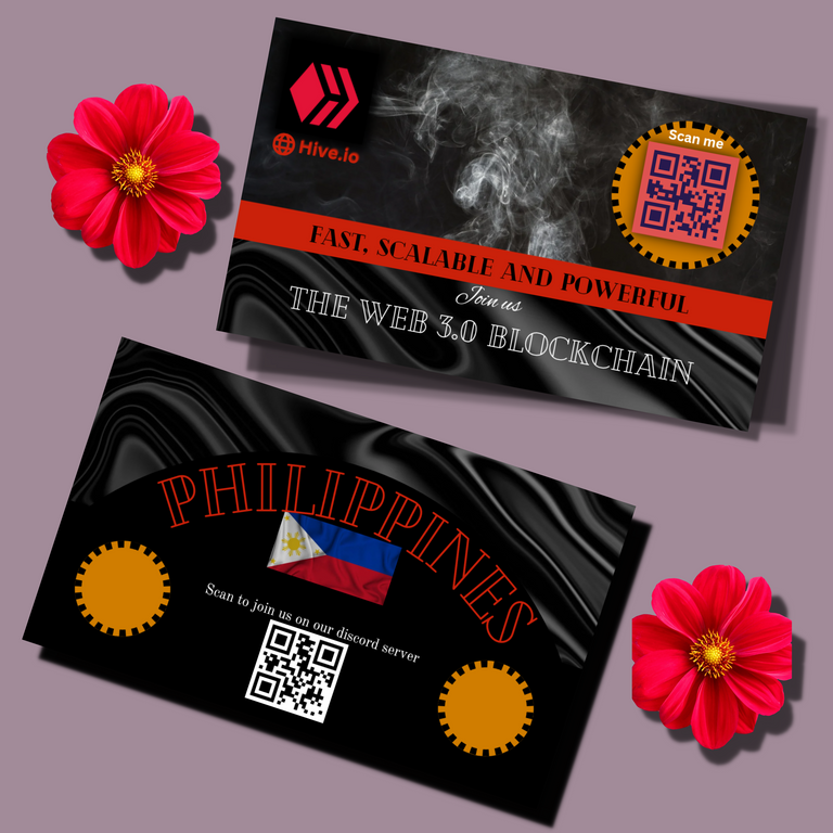
This time around i decided to give the design a more complex look giving it class and extra beauty, as usual i decided to use the black colour as my main colour in the design after which i added some other colours like red,a gold like colour and also white colour.
Here are the processes for the design.
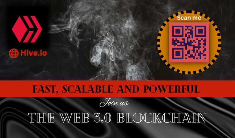
I gave the background a smoky effect that implies that the hive blockchain is on fire right now and what might be the biggest thing most people are missing out from in this 21st century.
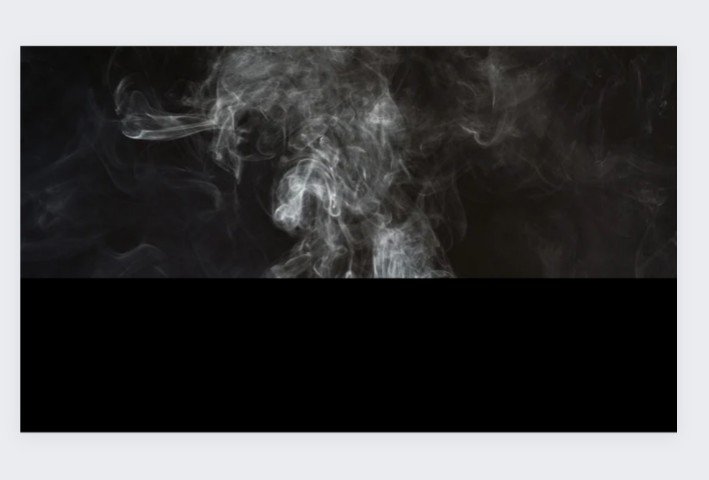
After which i gave the design a wave at the bottom side of the design to give it more class as usual😊.
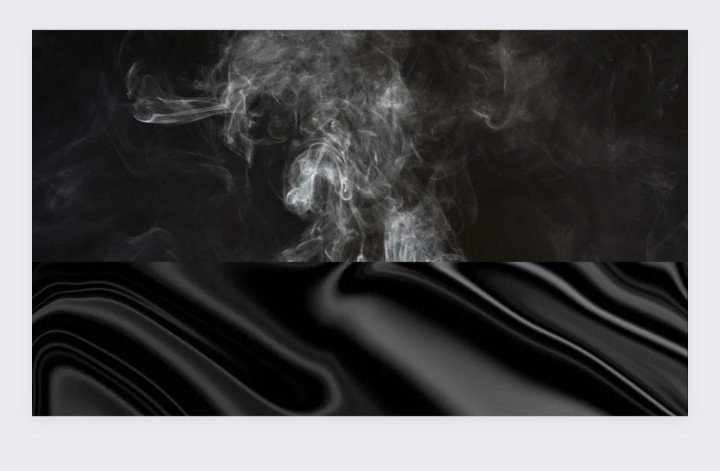
Being satisfied with the background design i started add more colours like the red line to distinguish between the top design from the bottom design and also i added a gold like round colour to give it a touch of royalty because hive community is for sure of royalty.
I included the hive logo and the web name at the top left corner .
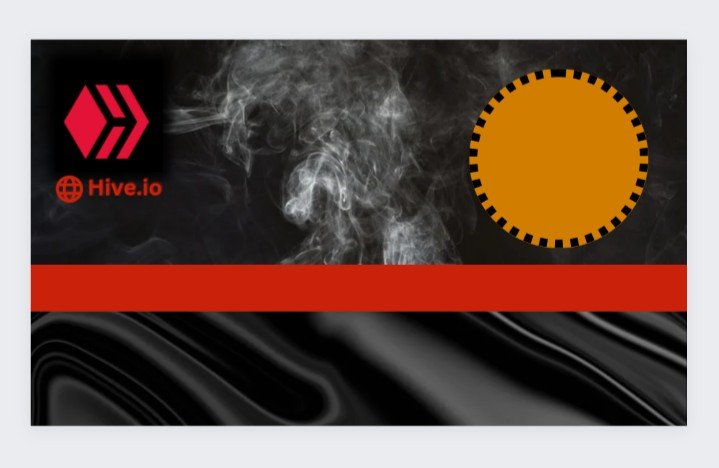
After the design was good enough to input the qr code and the text, i wasted no time and included it asap.
The final process of the front page.
The back page started with a wave feel that was at the bottom of the front page design making it seems like the design went from the front page all the way to the back page.
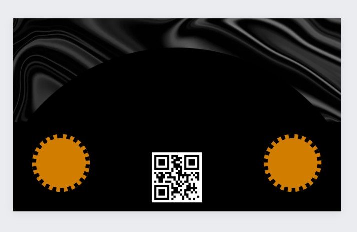
After that i gave it a double royalty gold colour same as the front page, one on the right and left respectively.
I included my qr code at the middle of both the circle.
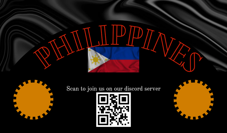
Lastly for the design at the back page i included the philippines name and their flag to end things well, as you can see below that i added a text curve to the philippines name to give it a more befitting design.
I hope you all love this design as well and i wish myself the very best of luck in the contest.