When I started out on the Hive blog using the Hive.blog frontend, one of the things that put me off at first was the interface...
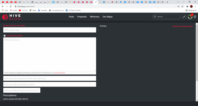
It wasn't like the conventional social media platforms. To me, it was complicated. From having to use coding syntaxes for the Bold, Italics, and Headline functions to quoting a sentence, it was just not easy to understand.
@starstrings01 actually did a wonderful job trying to explain these things to me but I found it more and more difficult to use. It was as though one was using a 20th-century social media application. Pardon my exaggeration but that was really how I saw it. And truthfully, it was one of the reasons I didn't really take the Hive platform seriously at first.
Well, it may not have been that bad for you, probably you are smarter than me but then you would agree with me that the conventional Hive Blog website isn't as refined and simplified as the PeakD platform.
I understand that Hive.blog offers a more technical view and is definitely superior when it compares to other frontends on this but I think it's time we go "make the user experience superior" way. UI/UX plays a very major role on how users relate to websites these days.
The tech still stays superior (for coders/builders) but users really don't care much about that. Well, I'm sure they appreciate it, but the truth is we don't come here for that alone. We need aesthetic when it comes to where we relate with people.
Although according to statistics provided here by @dals , it shows that Hive.blog frontend still has a lot of users but I think people are beginning to appreciate using the newer, user-friendly platforms like @peakd @leofinance and @ecency. @splinterlands has also come into the for-eplay and has been hitting the right spots in gaining attention and 3speak still comes ahead when it comes to video contents.
 The Hive.Blog FrontEnd

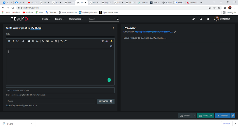
PeakD Front-End

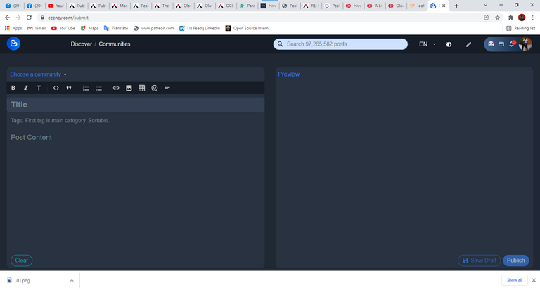
Ecency Front-End
So I'll be listing some of the reasons why I prefer the PeakD publish frontend compared to the hive.blog publish frontend and others;
- The PeakD platform has a social blogging feeling. It seems more of a platform for blogging because it has tools that the average blogger can understand and use easily.
- It has an option to also switch the writing interface to HTML mode
- It supports GIF
- It makes adding external links easier
- The quote function helps writers with easy referencing
- It has the undo and redo options.
- It has the 'schedule post' unlike others.
- One can 'save to draft'
amongst many many others🤓
This post is not an attempt to rubbish any of the other frontends. They are all impressive in their own way. This is a matter of personal choice which might simply not resonate with everyone...
Some people who started out with the Hive.blog frontend might really not find it easy to make the switch to another frontend.
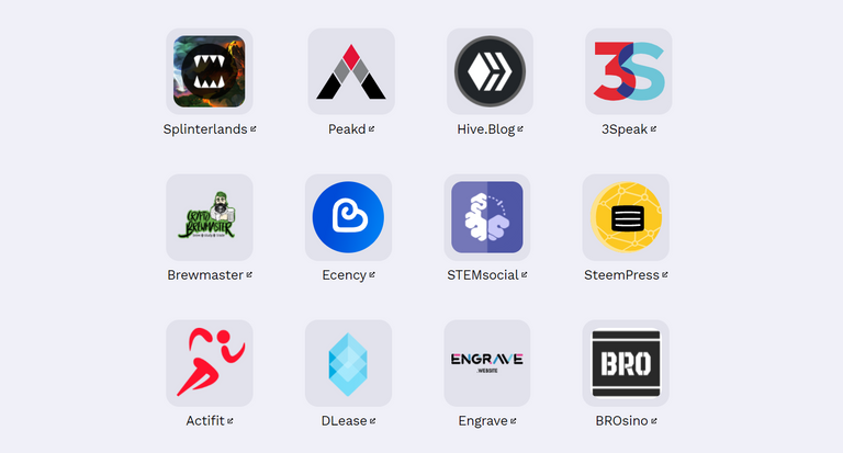
All together the general frontends and niche-specific frontends all make blogging and Hive very easy and fun.
In the end, it's a matter of choice or necessity.
 Most popular Hive Frontends (General and Niche-specific)
So which are your most preferred frontend??...
Comment below.👇
Omo, i never knew there were as many frontend like this much o @profgabs05. Its a good one explaining what you like about your preference, atleast now I know the other HIVE frontends as you called it.. But,literarily,are they called frontends?
More like different platforms but yeah they are referred to as Hive frontends...
Oh I get that now - frontends..
@profgabs05 I'd even love to check out the other platforms. I would love you put me through when i am on the journey. Would you?
Would be willing to....
Thanks,man!