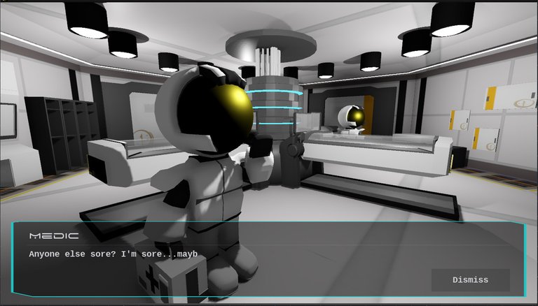
Warning: Lots of animated Gifs ahead.
With WayFinder now looking for investors the weekly log is back in swing. This weeks update is a pleasant smattering of bug fixes, visual updates, and general improvements (some of which I'm not sure are actual improvements)
Bugs Fixed:
- Path Finding: This one has driven me crazy since I started the project, but as of this week I can finally put it to bed. I could fill volumes explaining all the ways I've tried to get it to work, but like so many issues the solutions presented itself when I was no longer focusing on it and helped me get rid of a good amount of code in the process.
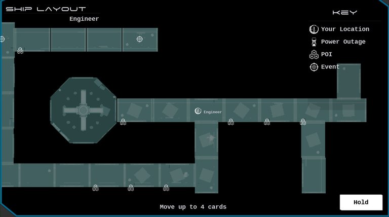
Notice how many paths are open to the Engineer. Before the path finding code couldn't handle branching paths as shown in the image.
Battle Restart: Once a battle was over and the next battle began a few variables weren't being reset causing the next battle to feel rushed and broken. This is fixed, but will require more testing.
Player Rotation: Introduced during the first bugs fix was that the players were no longer turning the right direction to match their paths. This has been completely re-written to make for a more robust system.
Interface Work:
2D in 3D is pretty old hat, however a lot of rework is being done to move all of the interfaces to viewports that appear in 3D space. This way the interface in the ship, the Player HUD, and the battle scenes can be as rich as possible for the player.
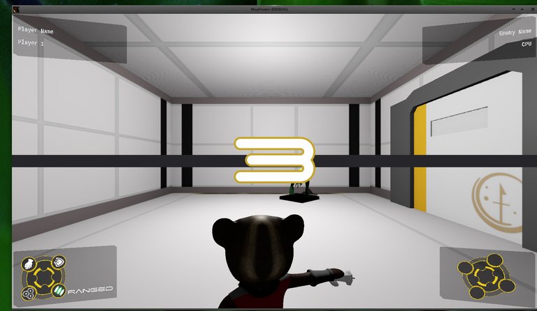
Battle info displayed as 3D items. Final layout not yet decided,and the Countdown is not yet converted.
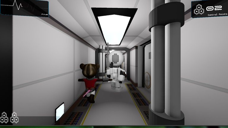
3D HUD for the player shows the usual information. Placement and look are still being decided upon.
Animations!
One of the biggest improvements that comes from moving the 2D items to 3D in the method I have employed is that animating these items has become much simpler, and isn't affected by resolution changes as much as they were at one time. Below are a few new animations added to the game this week.
Health Bar
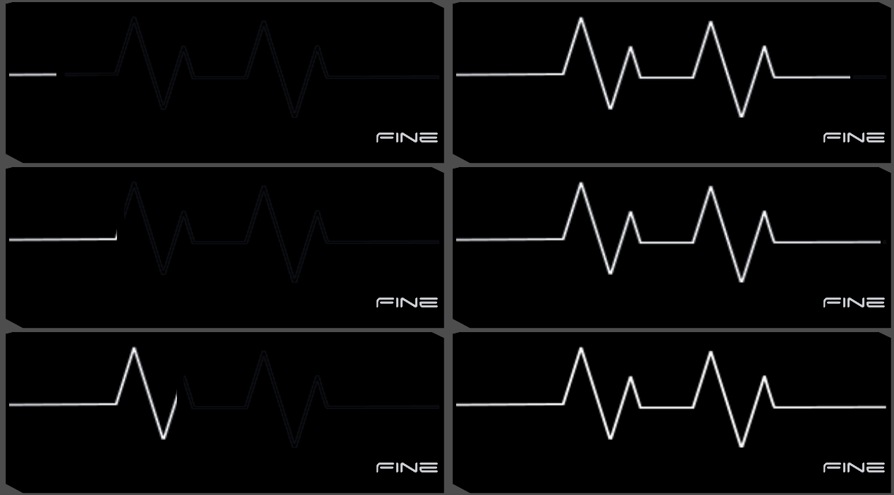
Similar to the way health is displayed in games like Resident Evil/Bio Hazard the heart rate changes based on the level of health the player has. This isn't as clear as the bars used in combat, but visually it feel more appropriate.
Attack Wheel

Used in Combat the attack wheel has been updated to support Keyboard/GamePad input, and now shows the selected command much more clearly.
Damage Response.
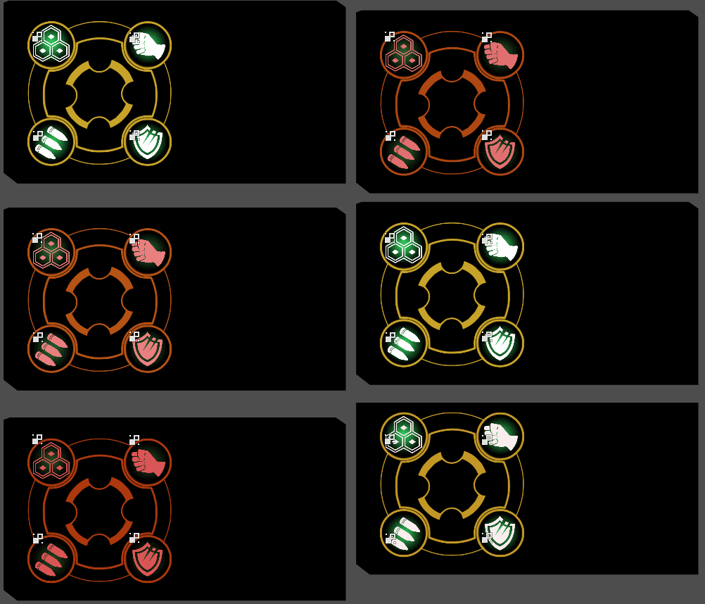
Requested by some of my testers, the entire wheel now shakes when the player takes damage. This along with the player animation makes for a much more active scene.
Road Map
The next set of updates are planned for November.
- Better Combatant placement
- Combatant AI outside of Combat. (Move freely around the map, choose to attack or ignore players)
- Moving all current 2D interfaces to 3D.
- Card rework to ensure map paths always line up.
- Intelligent "Special" room addition to ensure overlaps wont occur.
For those curious about this project and its development check out this post. It will be updated with the newest information when it has been published here on the Hive network.