Colorchallenge rules have changed
Take a look here for @kalemandra's updates
My design method #1

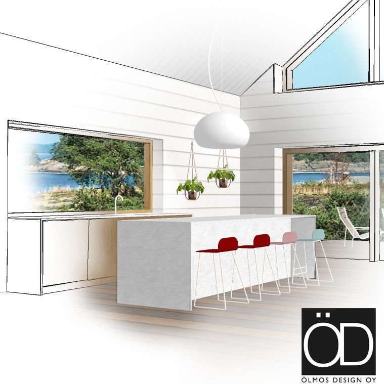
Here's a sketch I did yesterday.
Notice that there is quite little red in the interior, but it is still the leading color! Playing with colors, patterns and forms is a fun thing to do, but it really takes time to find the right palette. Even if the interior is minimal and plain like in the sketch above!
So this sketch was done wit Sketchup Pro and the post-processing with Photoshop. I loooove Sketchup and I've worked with it now for about 5 years. It's a fabulous program for sketching and making fast visualizations. When you show a picture like this for your client, they usually like and respect it. It gives them the feeling of the space, and combined with realistic material examples, you get a good picture of designer's visions!
Photo-realistic rendering grows more popular each day, but I feel there's no artistic side in doing them. Now I mean that I personally like the manual sketch look. I have done photorendering together with a pro, for a client that needed sales pictures and I might do a post about it in the future, it was also fun.
Sketchup Make is free for anyone
Want to sketch your living room interior and try a new sofa? Go download Sketchup make. Do you think I should start making Sketchup interior design tutorials for Steemers?
<3 :) Have a great week everyone @olmosdesign
Awesome interior in the house
This is a great design, but where is the dominant red color? :)))
Isn't it dominant? I think the red chairs catch the eye quite fast, as a designer ! :)
You got a 0.86% upvote from @postpromoter courtesy of @olmosdesign!
Want to promote your posts too? Check out the Steem Bot Tracker websitevote for @yabapmatt for witness! for more info. If you would like to support the development of @postpromoter and the bot tracker please