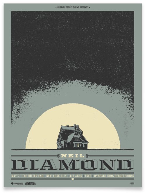
If anybody used to read my website blog, you will have seen that I loved to write posts about the artists who inspire me.
I absolutely loved to do this because it always helps spread the word of their work and I get some satisfaction knowing that I may have made someone's day that little bit better.
I wasn't able to keep this going before but it is definitely something worth doing that I enjoyed, and hopefully all of my viewers will get to appreciate some lovely artwork!
To kickstart this back off, please let me introduce A. Micah Smith.
I have been following him for some time on Twitter and really grown to love his work.
As I can see from his website (www.amicahsmith.com), he is a Creative Director from Kansas City, and has worked with some incredibly prestigious clients such as, TED, Sony, Myspace and Taco Bell.
I have put a few examples of his work for you to view below.
Some of the things I like in particular;
- Diversity - I find that the work doesn't repeat itself in the style used or the colours chosen. Every different piece of work is solely made for the purpose of the brand it is representing. Nowadays, a lot of artists find their styles and they stick to it. And whereas, I agree that if you find something great, stick to it, you can see that this art fully caters to the taste of the clients.
- Band posters - All of the band posters that I have come across look fantastic. They are a particular style that I love where it looks somewhat screen-printed. The colour choices look nice and vintage and they give off an all-round edgy vibe.
- Materials - If you take a look at the website, you'll see that the artist doesn't just stick to paper. He branches out and uses other materials. The Taco Bell design below, looks as though it has been printed on jersey material, and you'll see on his page, he has even made cushions with the designs!
These are three of the many things I enjoy about the work and I hope that you'll agree.
As I said, please go and check out his work, he deserves the recognition!
